Future Cities.
A future-facing event identity for a corporate real estate programme.
The identity used bold imagery, colour and visual storytelling to bring more energy and imagination to a topic that could easily have felt generic.


Client / Context
JLL New Zealand · Corporate real estate event
Role
Art direction · Event identity · Campaign design · Creative rollout
Deliverables
Event identity · Digital assets · Signage · Presentation graphics · On-site collateral
Focus
Brand · Campaigns · Event design · Visual storytelling
The challenge
Make a corporate real estate event feel more distinctive.
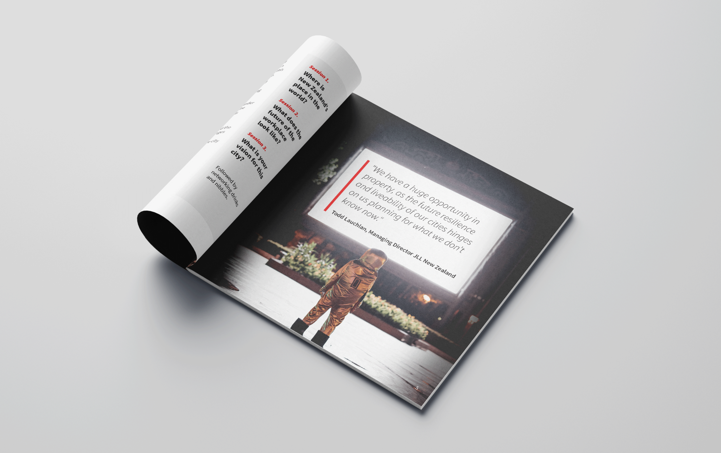
Future Cities Perspectives explored how cities, workplaces and investment could evolve. The challenge was to create an event identity that felt future-facing and engaging, while still sitting comfortably within a corporate brand environment.
The subject matter had the potential to feel broad or generic, so the creative needed a clear visual idea that could carry the event across digital, print and on-site formats.
My role
I created the event identity and shaped the visual direction.
I developed the creative direction, selected the imagery style, built the layout system and applied the identity across event materials.
The work needed to feel more imaginative than a standard corporate real estate conference, while still being polished, legible and practical to produce.
The approach
A bold visual idea, handled with restraint.
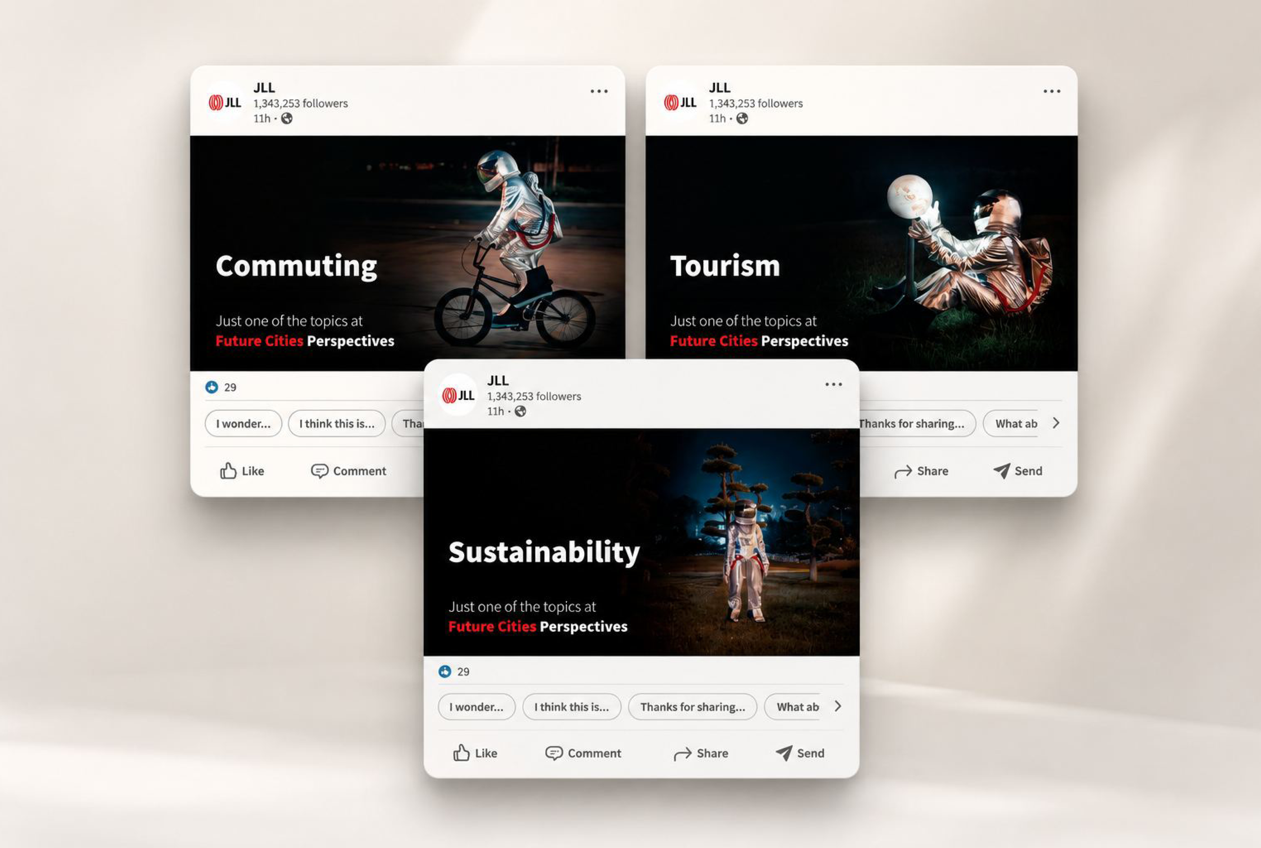
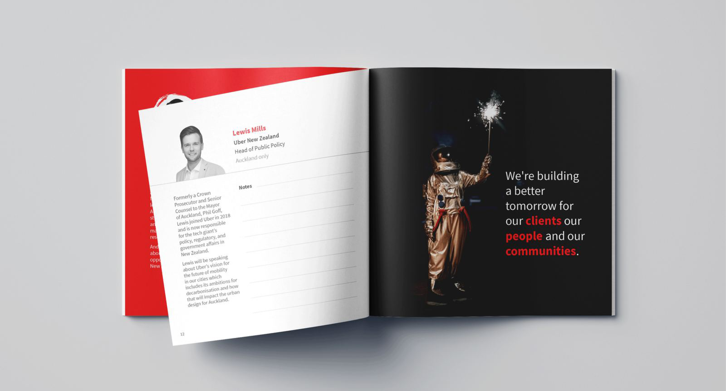
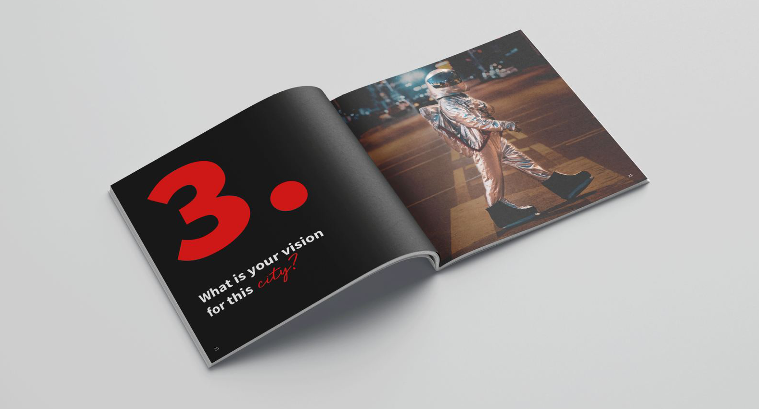
The identity used a playful astronaut image to give the event a memorable focal point and connect to the future-facing theme.
To keep it credible, the design relied on structured typography, controlled layouts and a focused colour system. This helped balance the more unexpected imagery with a clear, professional event framework.
Key considerations
Corporate credibility
The identity needed to feel imaginative without losing the trust and polish expected from a JLL event.
Visual storytelling
The astronaut created a clear metaphor for future thinking, exploration and possibility.
Brand fit
The design needed to work within JLL’s broader brand environment while still giving the event its own character.
Event rollout
The system needed to work across invitations, digital communications, presentation graphics, signage and on-site collateral.
Production clarity
Layouts needed to be simple enough to adapt quickly across multiple formats without becoming inconsistent.


The impact
Outcome
The identity gave the event a more distinctive and memorable presence, helping a corporate real estate topic feel more engaging without losing polish or credibility.
It created a flexible visual system that could work across digital, print and on-site event materials.