Bhone.
Brand application for a premium wellness product launch.
I extended the Bhone brand across packaging, retail, digital and promotional assets, helping create a more consistent and polished product presence across launch materials.
Client / Context
Bhone · Premium wellness product launch
Role
Brand application · Packaging layout · Promotional design · Creative rollout
Deliverables
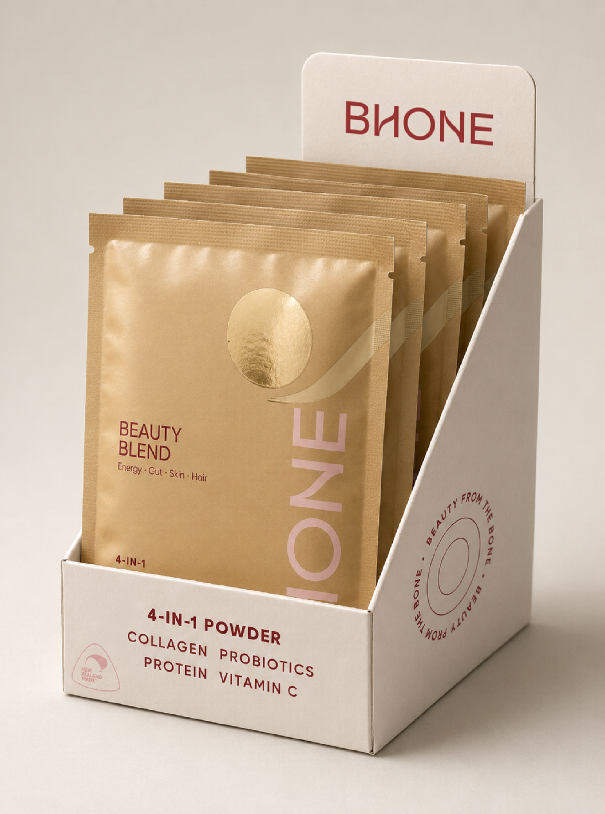
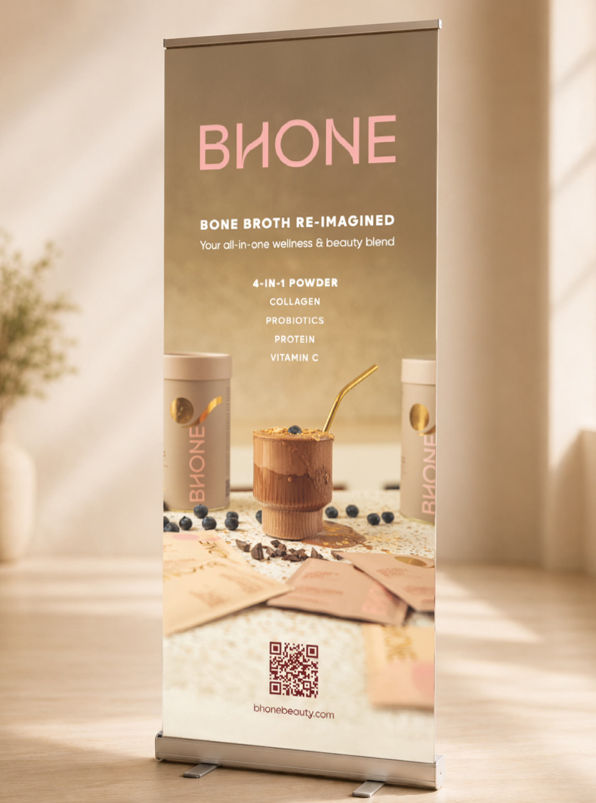
Packaging assets · Retail displays · Digital and promotional materials
Focus
Brand · Packaging · Wellness · Multi-format design
The challenge
Build consistency across a growing luxury brand.
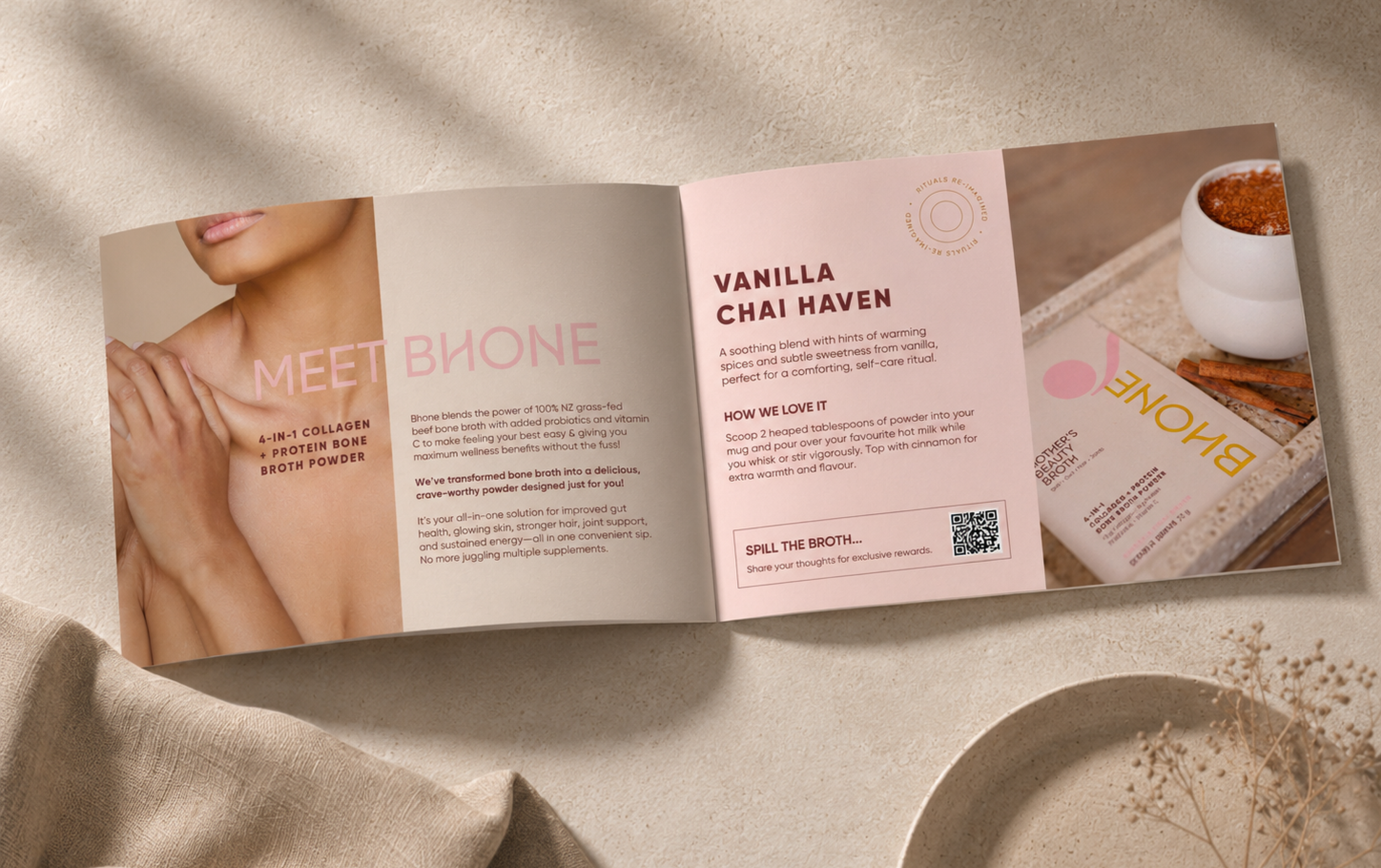
Bhone was launching a premium wellness product in a category where trust, taste and lifestyle appeal all mattered. The brand needed to feel polished and desirable, while still communicating the practical product benefits clearly.
The challenge was to apply the existing identity across multiple formats in a way that felt cohesive, premium and ready for real-world use.
My role
I extended the brand across launch and ongoing assets.
The core identity had already been established, and my role was to apply and develop it across practical brand touchpoints.
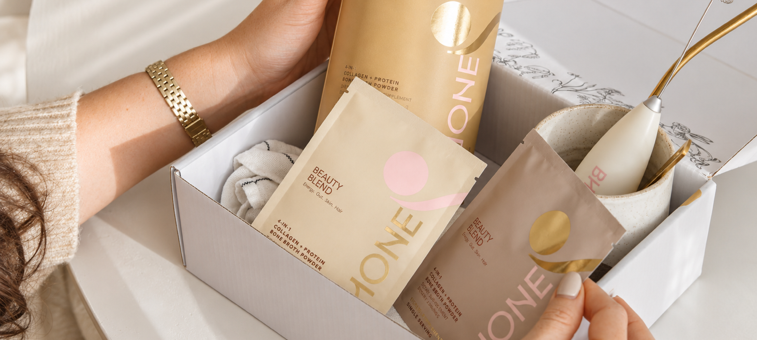
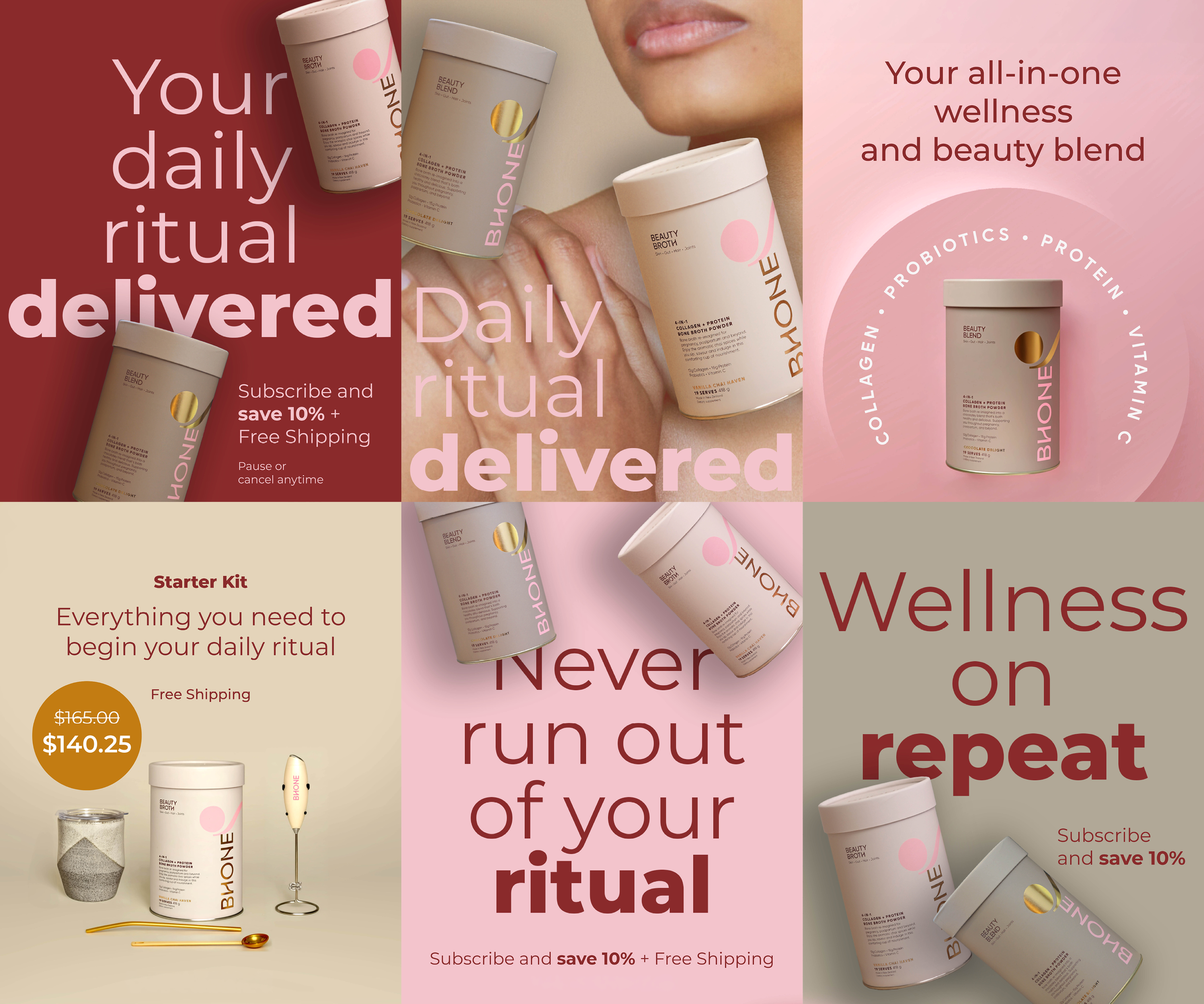
I worked across packaging layouts, retail and promotional materials, digital assets and display formats, making sure the brand felt consistent, considered and suitable for a premium wellness audience.
The approach
Premium, warm and practical.
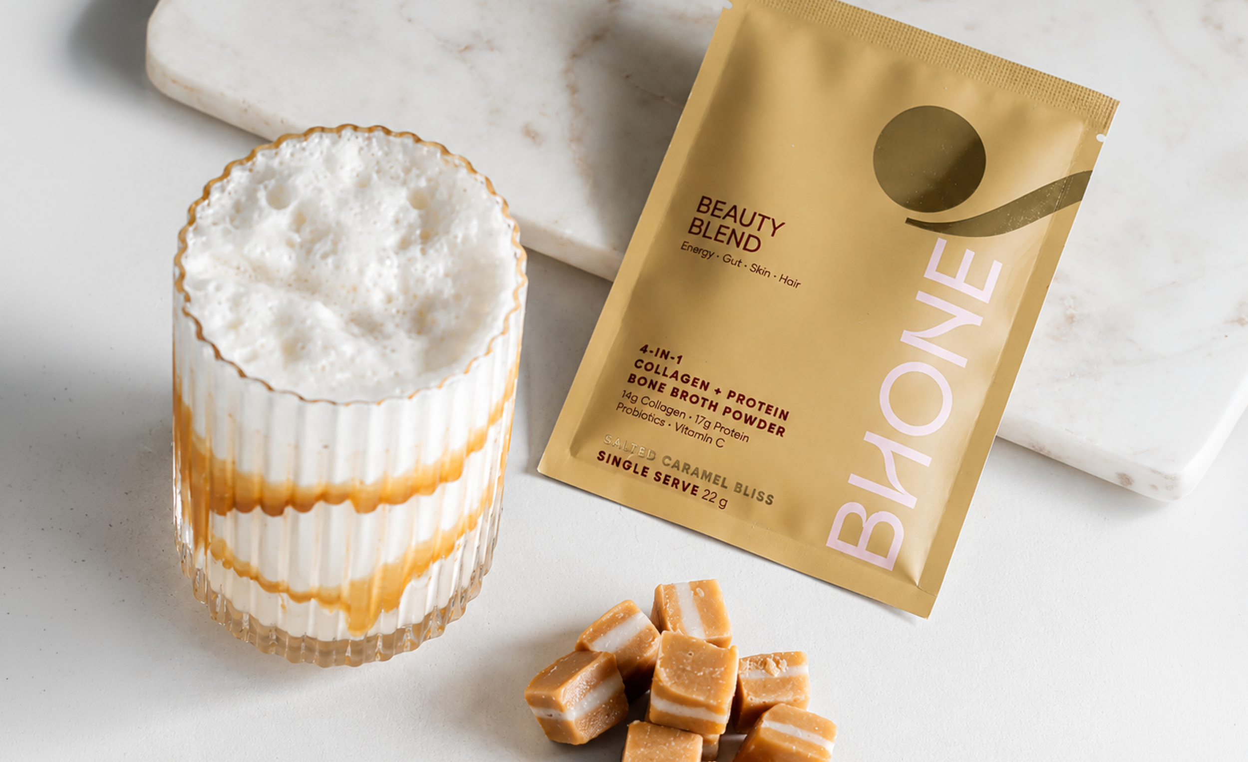
The design needed to feel elevated without becoming too clinical or too decorative. I focused on clean hierarchy, warm product presentation, considered spacing and a visual system that could flex across packaging, retail and digital formats.
The aim was to make each asset feel like part of the same brand world while still serving its specific job, from product information to in-store visibility.
Key considerations
Brand consistency
The existing identity needed to be applied consistently across different formats, sizes and production requirements.
Product clarity
Packaging and promotional assets needed to communicate key product information clearly and confidently.
Premium wellness feel
The visual direction needed to feel warm, polished and desirable without looking overly cosmetic or generic.
Retail visibility
Display materials needed to stand out in wellness, studio or retail environments while still feeling refined.
Format flexibility
The system needed to work across packaging, banners, digital assets and smaller promotional pieces.
The impact
Outcome
The work helped create a more cohesive and premium brand presence across Bhone’s launch materials, from packaging and retail display to digital and promotional assets.
It gave the product a clearer visual system across customer touchpoints while keeping the brand warm, polished and easy to understand.